Landing page case study
One-page offer rescue with a clearer CTA
A compact landing page structure for a service or product that needs a clearer offer, visible proof, and a working contact path.
Problem
Most small service pages hide the next step
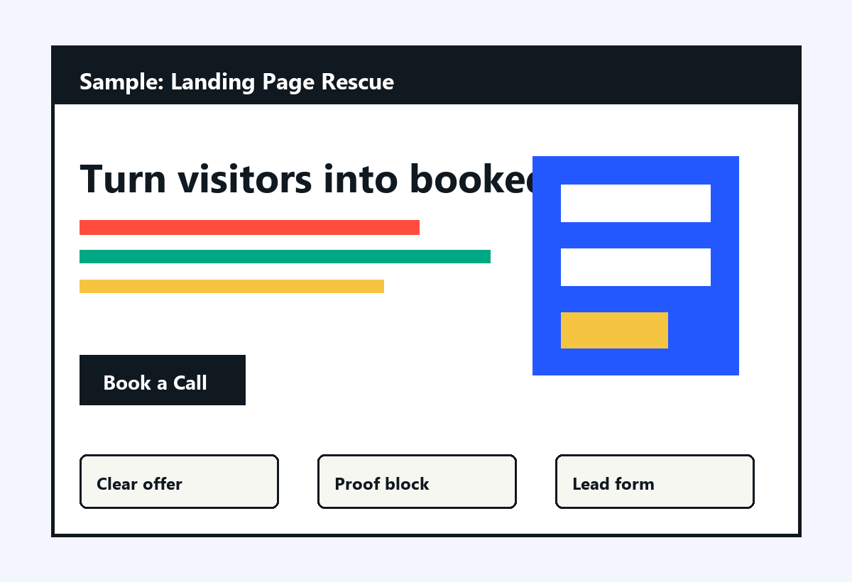
A landing page rescue focuses on one narrow conversion path: explain the offer, show proof, answer friction, and route the visitor to email, WhatsApp, or a short form.
- Headline rewritten around the concrete outcome.
- Offer cards with price anchors and deposit rule.
- Proof section with screenshots, demo links, or artifacts.
- Lead capture form and direct marketplace CTA.
Deliverable
Sharper page, fewer dead ends
One-page HTML or Next.js page
Clear CTA
Lead form
Handover notes